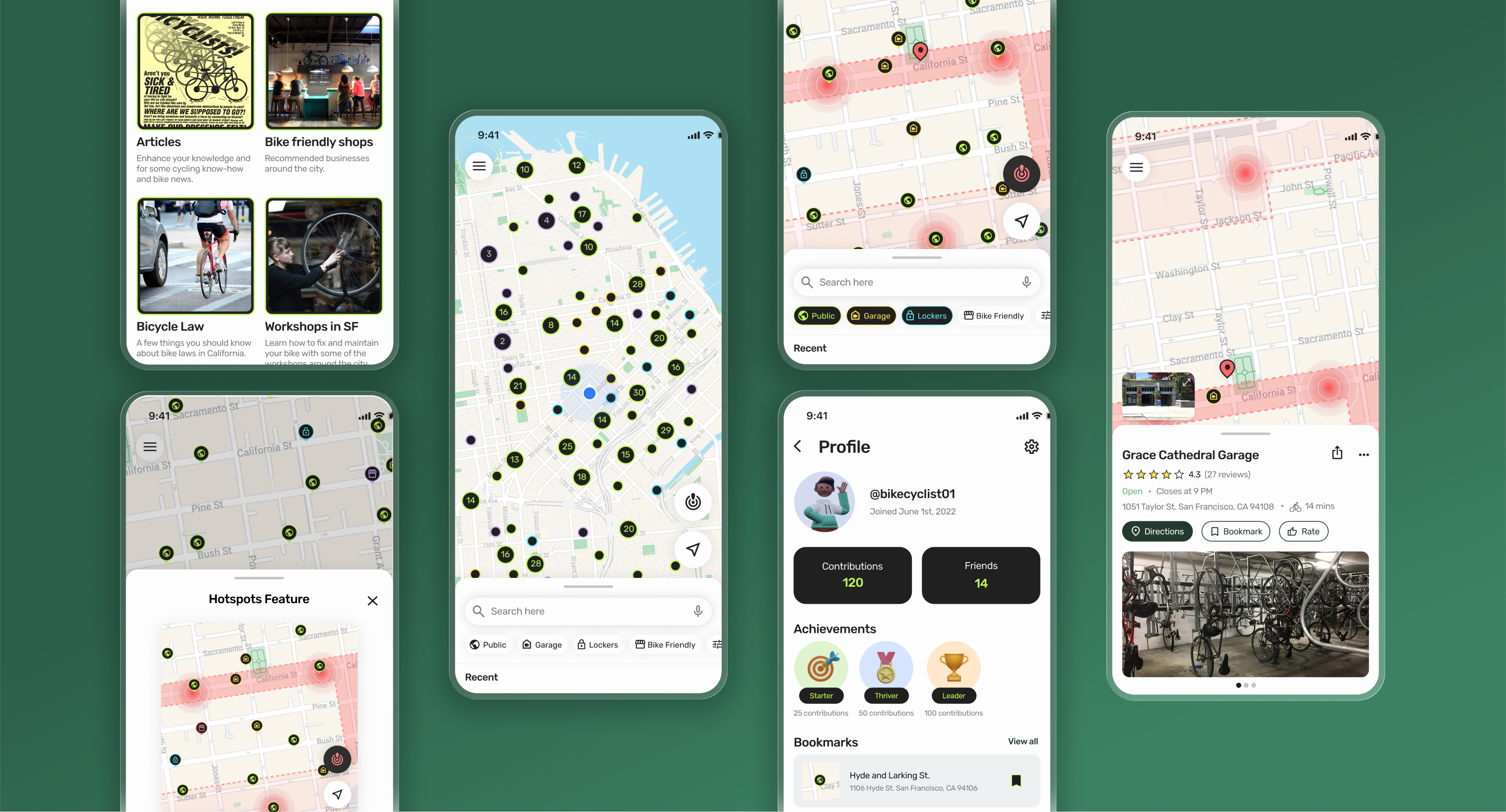
A mobile App to help cyclists find safe and secure bike parking options - Proof of concept.
I recently started commuting by bike to the office and quickly realized the challenge of keeping a bike safe in a big city like San Francisco, especially when making plans after work. I love cycling—it’s an efficient, fun, and eco-friendly way to get around. But the constant worry about secure parking to avoid theft can be a real barrier. This experience inspired me to explore a solution to help cyclists like myself find safe, convenient parking options.
Despite cities’ recent efforts in improving bike infrastructure, finding safe and secure parking remains a major challenge and an under-discussed topic for cyclists across the country.
How might we provide a seamless experience for cyclists looking for safe parking options?
Users can discover all available bike parking options in their area, including safer alternatives to street parking. With easy filtering options, they can plan their rides without the hassle of guessing, calling businesses, or endlessly researching online.
Helping cyclists stay informed about recent bike thefts and high-risk areas in their city, enabling them to make smarter choices when it comes to securing their bikes.
User reviews provide valuable insights into parking safety, street foot traffic, security, and bike theft incidents, helping others make informed decisions based on real experiences.
A smooth interactive experience introduces new users to the app's features, along with helpful tips on bike locking practices to reduce theft risks.
During this research, I explored open data sources like local government websites, bike advocacy groups, and forums such as Twitter and Reddit to gather insights on bike parking locations and theft. I found that security concerns significantly influence people's decision to bike, and there is a lack of tools to help cyclists find safe parking.
I conducted 5 user interviews to understand how cyclists protect their bikes and the challenges they face when finding parking. Currently, cyclists rely on time-consuming methods like manually scanning for bike racks, asking local businesses, or searching online for information. These approaches are often unreliable, making it hard for cyclists to feel confident leaving their bikes unattended.
How can we design an intuitive interface for easily filtering and searching safe and secure bike parking options?
How might we help cyclists make informed choices about where to park safely in public spaces?
How can we make it easier to assess the safety of different neighborhoods or streets for bike parking?
Based on my research insights, I brainstormed ideas and identified opportunities. To focus on the most impactful ones within time constraints, I narrowed down to 4 key features:
I created user flows to show how users navigate the different app's features. The flow below illustrates how a user would find a safe and secure parking spot near their destination.
Starting from scratch with Velos, I began by sketching initial ideas and creating low-fidelity wireframes to explore a wide range of options, study how features would behave with one another, and establish a clear information hierarchy. I iterated through multiple versions, using usability testing to validate concepts and identify areas for improvement. Each round of refinement added fidelity and helped streamline the overall user experience.
For the Velos app, I aimed for a vibrant, modern design to appeal to a younger, active audience. I used neon colors to differentiate parking options and incorporated these bold accents throughout the app to create a cohesive, energetic feel.
To ensure a consistent and intuitive user experience, I developed a set of components and a small design system, making it easier to scale as the app evolves.
The interactive map helps cyclists find bike parking options, plan their routes, and get further information on bike parking facilities.
Drawing inspiration from familiar and user-friendly map designs like Google and Apple Maps, I aimed for simplicity and intuitiveness to make information clear and accessible by:
For the Hotspot feature, I wanted to present bike theft data clearly, initially using color coding to indicate risk levels (e.g., green for low, red for high). However, I later switched to a single color—red—with varying intensities to improve accessibility for color-blind users and make the feature more intuitive.
As I wrapped up the design, I refined the prototype and added animations to make the app more dynamic and engaging. I really enjoyed this process, and seeing everything come together was a highlight.
These details added personality to the project, and during usability testing, users often expressed excitement and positive feedback, appreciating how the interactive elements enhanced the experience.
Finding safe and secure bike parking has never been so easy or straightforward. The Velos app helps cyclists locate nearby parking, explore safer alternatives to street parking, and assess theft risk in specific areas. Users also have access to resources for minimizing the chances of theft, requesting new bike racks from the city, and discovering bike-friendly businesses.
This project taught me the value of trusting the process and gathering feedback early and often. Conversations with fellow cyclists provided valuable perspectives and solutions. I also learned that selecting the right fidelity at each stage helps in saving time.